A new website explained in 10 Steps

Published:
UX and UI Design: How do we arrive at the best user interface and great user experiences? The solution always lies somewhere in the interplay between function, communication, and design. In the following, I will talk about how I, as a UX designer, along with my colleagues and the client, work to come up with the best solutions.
Structure and creativity
What primarily characterizes our successful projects is a clear structure, while creating space for creativity. Because it's in the interplay between technology, communication, and design that we find the good solutions. A homepage often plays a central role in the digital ecosystem, and thus requires diverse expertise, beyond UX and UI. A homepage often plays a central role in the digital ecosystem, and thus requires diverse expertise, beyond UX and UI.
A jungle of models
For example, if you ask Google, you might get the impression that there are as many models and processes as there are websites. To find the way that works best, experience is obviously required, but perhaps most important is adapting the process to the way you work, rather than blindly adapting to a predetermined process.
From brief to website
Based on our relationship with design, technology, and long experience in the digital world, our process can be explained in ten steps.
1. Brief and research
Everything starts with a brief and subsequent meetings to find answers to questions such as: What is the goal of the new homepage? What doesn't work with the existing solution? A clear brief and workshops give us an understanding of the client's needs in their industry.
2. Personas
Design is about solving the right problems for the right people. By creating personas of the most important target group segments, it's easier to identify their needs, problems, and what drives them.
3. Needs & HMWs
Here we delve deeper into what specifically the site visitor wants to achieve and how we can solve it. Based on the need, we create something we call HMWs (How Might We). An HMW is a short question, linked to a specific need or problem, that starts a thought process.
4. Brainstorming solutions
Based on the HMWs, it's time to brainstorm possible solutions. Here, there's a high ceiling, and all thoughts and ideas are welcome.
5. Priority matrix
In this phase, it's about filtering out the best ideas and which solutions should be prioritized. We look at what provides the most effect for users in relation to previous issues.
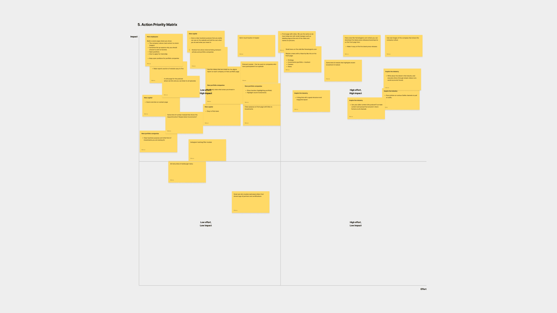
Example of a priority matrix
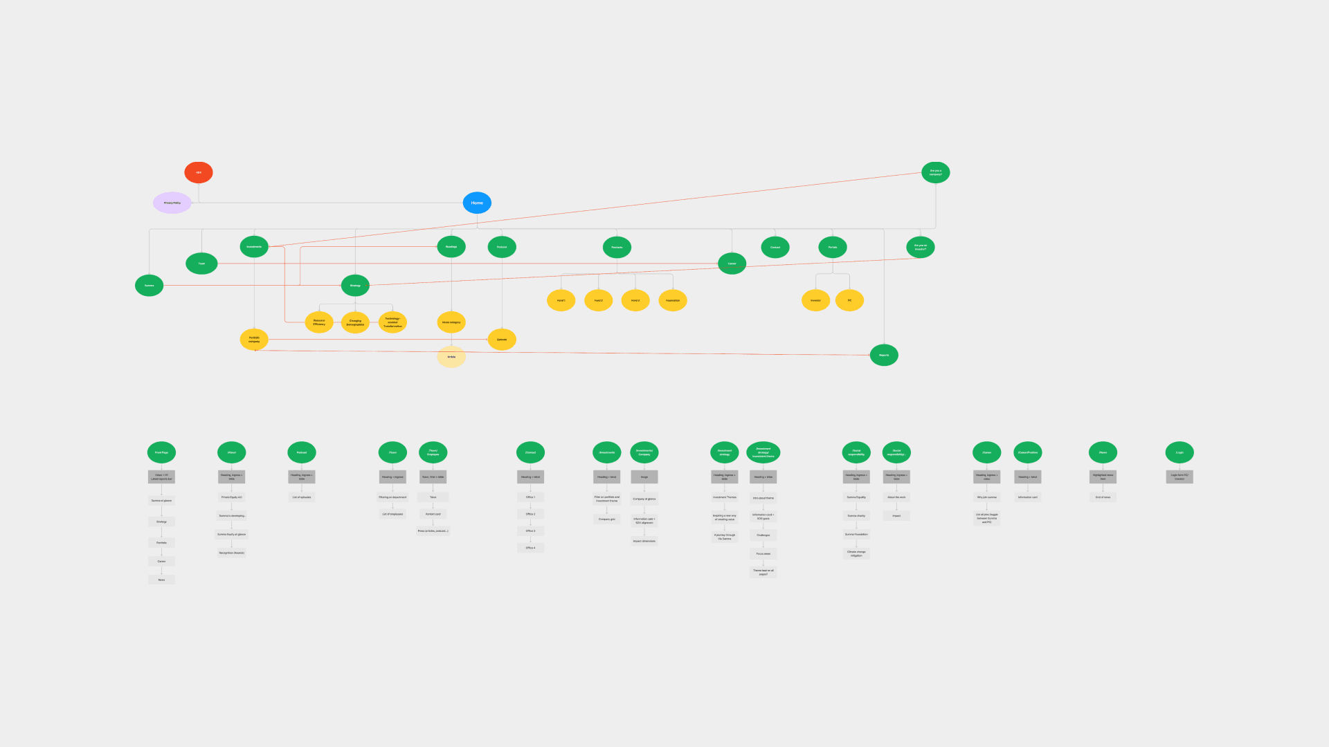
Example of a sitemap
6. Sitemap
A sitemap is simply explained as a map of all the pages on the website. We look at which pages should have sub-pages and how we should link internally to create a logical user flow.
7. Content hierarchy
Once we know which pages will be on the homepage, it's time to look more closely at the content. Providing the right information on the right page is a basic prerequisite for creating a good user experience. In this phase, we set the hierarchy of what should be communicated on each page.
8. Wireframe
A wireframe is a simple sketch. Here, we focus on functionality and insert demo content. The right content is often produced simultaneously as we design and program the pages. Only when wireframes are approved do we start the design phase.
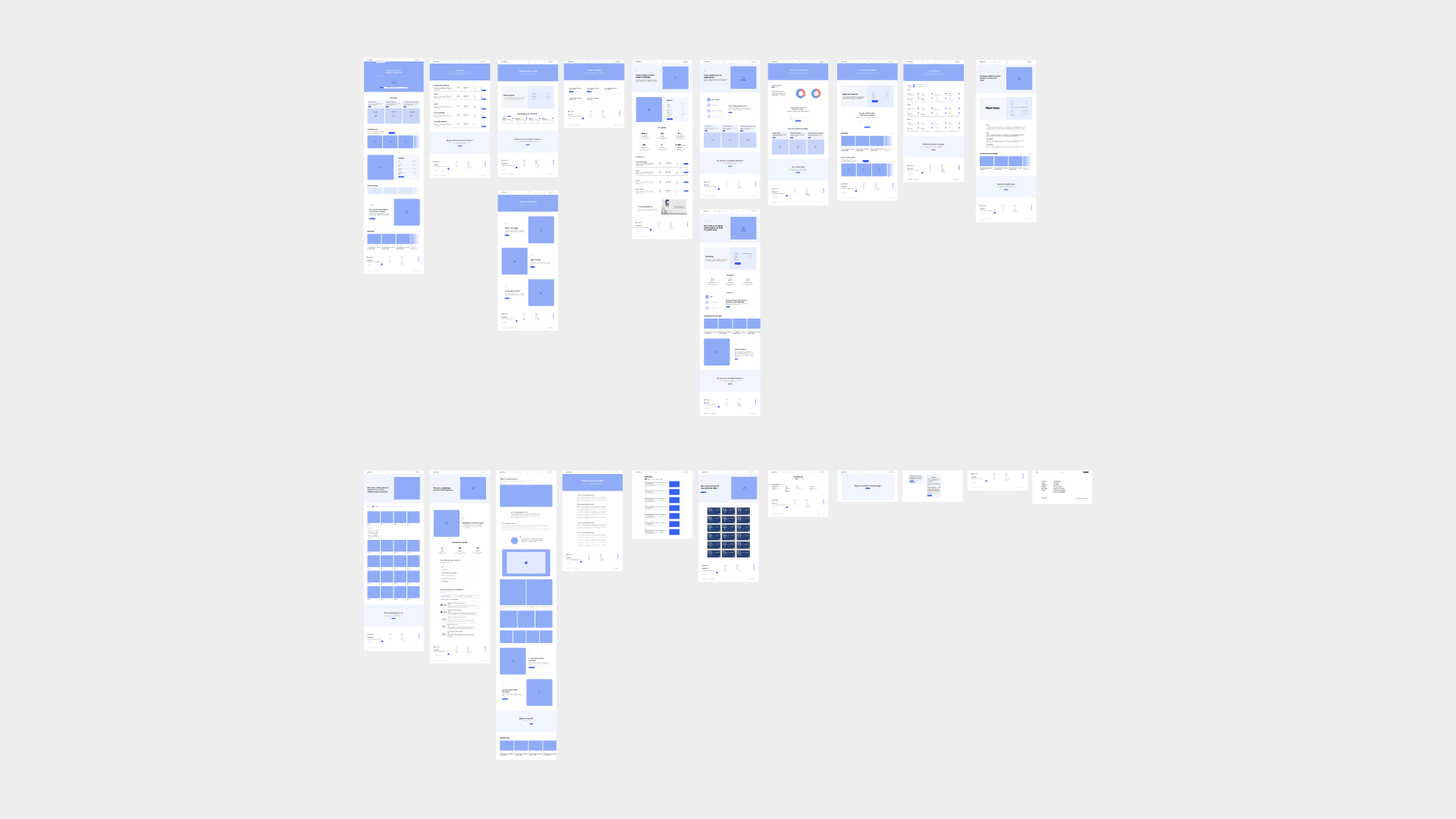
Example of wireframes
9. Moodboard
Moodboard is about finding a design direction, with layout and design, which comes into its own in the next phase.
10. UI/Design
The first thing we design is the front page, and once it is approved, we continue with the next pages. We believe it is important to create an experience that is aesthetically pleasing and simultaneously reinforces the strategic foundation we have developed in earlier phases. Will we use images and video? Should we create something new or perhaps use illustrations? Many of these questions we have thought about earlier in the process, but there are always new ones that arise.
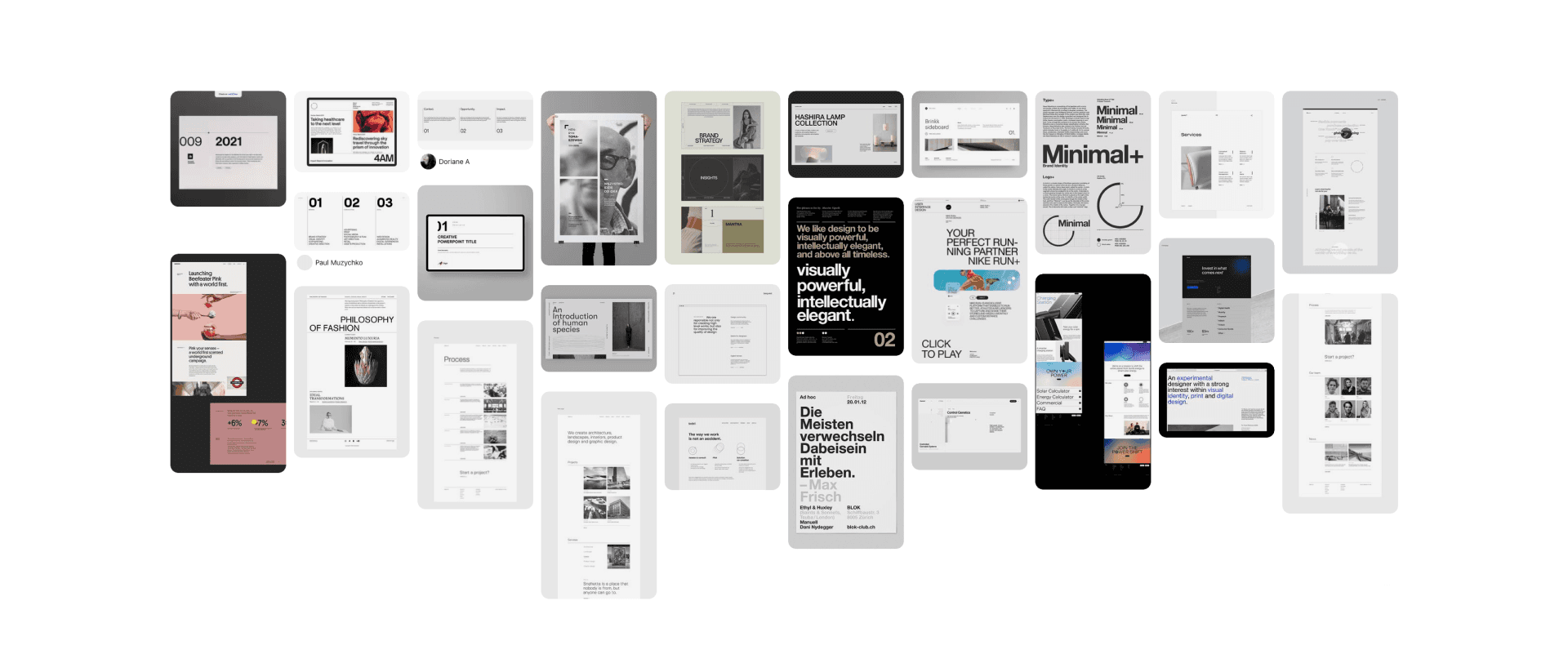
Example of a moodboard
Not a linear process
In a perfect world, we go uninterrupted from step 1 to 10, but building websites is rarely a linear process. Having a conscious approach to the process guides us in the right direction and creates the conditions for a successful project, but we also need to be agile enough to work parallelly with the different phases.
But perhaps the most important component in the recipe for a successful website is to always try to push the boundaries and go the extra mile.


